I love maps. On a genealogy Facebook group I follow, a researcher shared a map of his ancestors’ counties of residence by U.S. census year — and I immediately knew I wanted to make a map of my own.
Check mine out — I definitely have deep Southern roots with a few “strays” in the northeast:
Direct-Ancestors-Counties-of-Residence-1790-1940County boundaries change over time, so using this modern map to chart historical counties is not completely accurate. But it’s a cool picture of the mostly westward migration of my family.
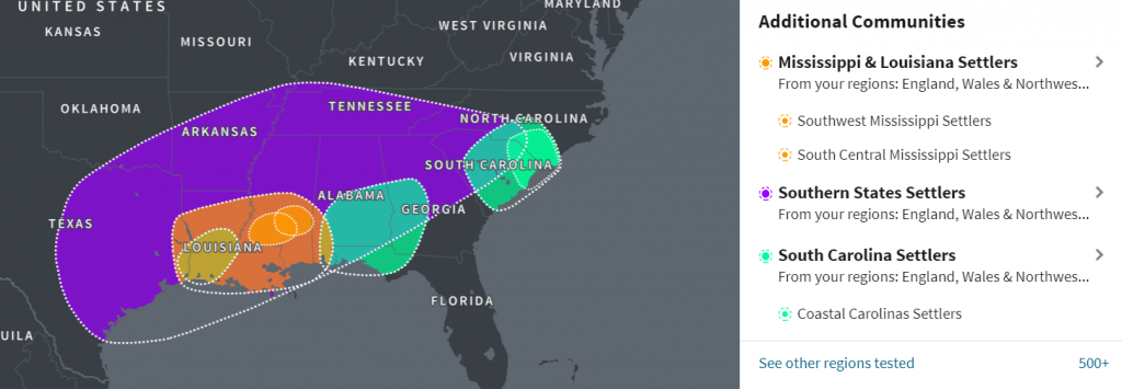
It also closely aligns with my AncestryDNA ethnicity estimates and migration communities: